Coloring Under the Lines in ggplot

I am tasked with explaining incredibly complex things to people who do not have a lot of time. Consequently, using visuals has been a life saver.
One day I was visiting a school explaining the Common Eurpoean Framework of Reference for Languages, which, in a nutshell, describes what language learners can do at different levels of proficiency AND the number of hours it takes for them to progress to each level.
During the presentation I used the following table in a slide:
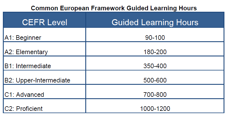 Image Courtesy of Keep Calm and Teach English
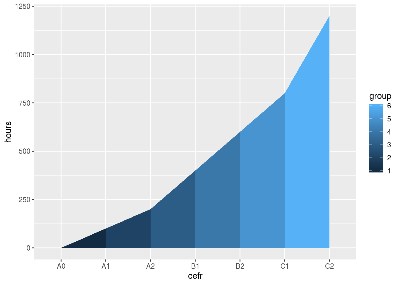
While that image is informative, it is, in my humble opinion, a little hard to comprehend in comparison to this one:

So how do you make the plot above? Glad you asked :)
Step 1: Create the data frame
As the table above shows, there are seven levels we want to represent (A0 to C2) and a range of hours from 0 - 1200.
library(tidyverse)
library(knitr) #To make the table look pretty on HTML

cefr_hours <- tibble(cefr = as_factor(c("A0", "A1", "A2", "B1", "B2", "C1", "C2")),
                         hours = c(0, 100, 200, 400, 600, 800, 1200))

kable(cefr_hours)
| cefr | hours |
|---|---|
| A0 | 0 |
| A1 | 100 |
| A2 | 200 |
| B1 | 400 |
| B2 | 600 |
| C1 | 800 |
| C2 | 1200 |
Step 2: Expand the data frame
In order to color the sections between the levels, we need to create groups so that ggplot() divides the the plot based on the correct levels. To do that, we’ll simply double the data frame.
cefr_hours <- tibble(cefr = as_factor(c("A0", "A1", "A2", "B1", "B2", "C1", "C2")),
                         hours = c(0, 100, 200, 400, 600, 800, 1200))

cefr_hours <- cefr_hours %>%
  bind_rows(cefr_hours)

kable(cefr_hours)
| cefr | hours |
|---|---|
| A0 | 0 |
| A1 | 100 |
| A2 | 200 |
| B1 | 400 |
| B2 | 600 |
| C1 | 800 |
| C2 | 1200 |
| A0 | 0 |
| A1 | 100 |
| A2 | 200 |
| B1 | 400 |
| B2 | 600 |
| C1 | 800 |
| C2 | 1200 |
Step 3: Create groups
Next, we rearrange the data frame by CEFR level (more on that later) and create a group for each level. To do so, we create a new column called group using dplyr::mutate.
cefr_hours <- tibble(cefr = as_factor(c("A0", "A1", "A2", "B1", "B2", "C1", "C2")),
                         hours = c(0, 100, 200, 400, 600, 800, 1200))

cefr_hours <- cefr_hours %>%
  bind_rows(cefr_hours) %>%
  arrange(cefr) %>%
  mutate(group = ceiling((row_number() - 1) / 2))

kable(cefr_hours)
| cefr | hours | group |
|---|---|---|
| A0 | 0 | 0 |
| A0 | 0 | 1 |
| A1 | 100 | 1 |
| A1 | 100 | 2 |
| A2 | 200 | 2 |
| A2 | 200 | 3 |
| B1 | 400 | 3 |
| B1 | 400 | 4 |
| B2 | 600 | 4 |
| B2 | 600 | 5 |
| C1 | 800 | 5 |
| C1 | 800 | 6 |
| C2 | 1200 | 6 |
| C2 | 1200 | 7 |
If we don’t use arrange() we get the following mess.
cefr_hours <- tibble(cefr = as_factor(c("A0", "A1", "A2", "B1", "B2", "C1", "C2")),
                         hours = c(0, 100, 200, 400, 600, 800, 1200))

cefr_hours <- cefr_hours %>%
  bind_rows(cefr_hours) %>%
  mutate(group = ceiling((row_number() - 1) / 2))

kable(cefr_hours)
| cefr | hours | group |
|---|---|---|
| A0 | 0 | 0 |
| A1 | 100 | 1 |
| A2 | 200 | 1 |
| B1 | 400 | 2 |
| B2 | 600 | 2 |
| C1 | 800 | 3 |
| C2 | 1200 | 3 |
| A0 | 0 | 4 |
| A1 | 100 | 4 |
| A2 | 200 | 5 |
| B1 | 400 | 5 |
| B2 | 600 | 6 |
| C1 | 800 | 6 |
| C2 | 1200 | 7 |
“What about ceiling()?”
Good question!
We use ceiling() in order to create the groups. Since we want “A1 to A2” to be one group, we need to return whole numbers. For more on how to use ceiling() please click here.
Step 4: Remove Unecessary Groups
Since we don’t want the first or last level to be a group unto itself, we use dplyr::filter() to remove the first and the last group by saying group is equal to all rows except for the min() and max() (i.e., the first and the last).
cefr_hours <- tibble(cefr = as_factor(c("A0", "A1", "A2", "B1", "B2", "C1", "C2")),
                         hours = c(0, 100, 200, 400, 600, 800, 1200))


cefr_hours <- cefr_hours %>%
  bind_rows(cefr_hours) %>%
  arrange(cefr) %>%
  mutate(group = ceiling((row_number() - 1) / 2)) %>%
  filter(group != min(group), group != max(group))

kable(cefr_hours)
| cefr | hours | group |
|---|---|---|
| A0 | 0 | 1 |
| A1 | 100 | 1 |
| A1 | 100 | 2 |
| A2 | 200 | 2 |
| A2 | 200 | 3 |
| B1 | 400 | 3 |
| B1 | 400 | 4 |
| B2 | 600 | 4 |
| B2 | 600 | 5 |
| C1 | 800 | 5 |
| C1 | 800 | 6 |
| C2 | 1200 | 6 |
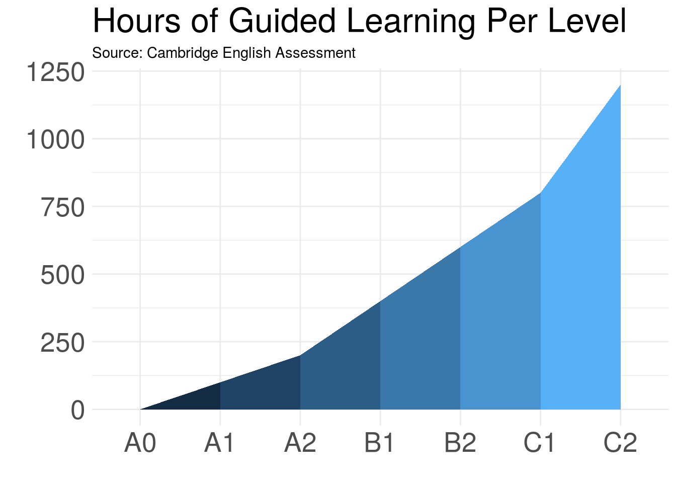
Step 5: Make the plot
From here, it is simply a matter of plugging the data into ggplot().
ggplot(data = cefr_hours, mapping =aes(x= cefr, y=hours, group = group, fill = group)) +
  geom_ribbon(aes(ymin = 0, ymax = hours))
But, of course, when we’re talking about ggplot(), that means we have no end of options at our disposal.
ggplot(data = cefr_hours, mapping =aes(x= cefr, y=hours, group = group, fill = group)) +
  geom_ribbon(aes(ymin = 0, ymax = hours)) +
  scale_color_brewer(palette = "Blues") +
  theme_minimal() + # Set the theme
  labs(title = "Hours of Guided Learning Per Level", # Give the plot a title
       subtitle = "Source: Cambridge English Assessment", # Give it a subtitle
       x = "", # Remove the title on the x axis
       y = "") + # Remove the title on the y axis
  theme(legend.position = "none", # Delete the legend
        axis.text.x = element_text(size = 20), # Set the size to 20
        axis.text.y = element_text(size = 20), # Set the size to 20
        plot.title = element_text(size = 25)) # Set the size to 25
Finally, a special thanks to Jordo82 whose answer to my question enabled me to make this plot.
#Complete code
library(tidyverse)
library(knitr)

cefr_hours <- tibble(cefr = as_factor(c("A0", "A1", "A2", "B1", "B2", "C1", "C2")),
                         hours = c(0, 100, 200, 400, 600, 800, 1200))

cefr_hours <- cefr_hours %>%
  bind_rows(cefr_hours) %>%
  arrange(cefr) %>%
  #create a group for A2 to B1, then B1 to B2, etc.
  mutate(group = ceiling((row_number() - 1) / 2)) %>%
  #exclude the first and last points
  filter(group != min(group), group != max(group))

ggplot(data = cefr_hours, mapping =aes(x= cefr, y=hours, group = group, fill = group)) +
  geom_ribbon(aes(ymin = 0, ymax = hours)) +
  scale_color_brewer(palette = "Blues") +
  theme_minimal() +
  labs(title = "Hours of Guided Learning Per Level",
       subtitle = "Source: Cambridge English Assessment",
       x = "",
       y = "") +
  theme(legend.position = "none",
        axis.text.x = element_text(size = 20),
        axis.text.y = element_text(size = 20),
        plot.title = element_text(size = 25))
Happy Coding!