Communicating IELTS Averages with Maps - Part II
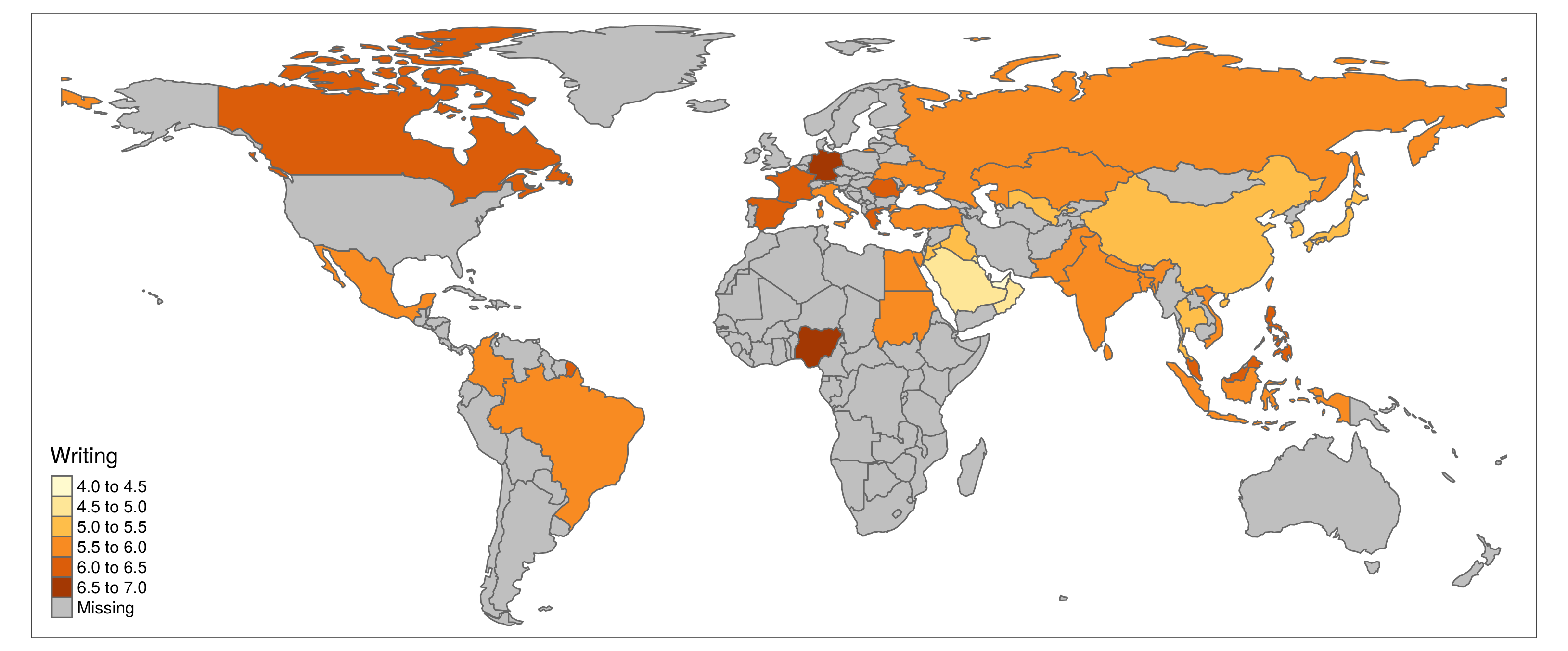
The previous post focused on collecting the data needed to make custom maps. This post will make use of that data to create maps like the one above as well as some others. While it isn’t necessary to read the previous post, it is recommended.
Step 1: Load the Libraries and the Data
Now, if you want to review, you can follow all the steps in the previous post. If not,you can read in the data by following the steps below.
1.1 Open the github site which holds the data.
url <- "https://github.com/educatorsRlearners/datasets/blob/master/scores_and_geoms.RDS?raw=true"
1.2 Create a temp file and then save the url in the temp file.
temp <- tempfile()
download.file(url, temp)
1.3 Read in the file and delete the temp.
scores_and_geoms <- readRDS(temp)

#remove the unnecessary variables
rm(temp, url)
Now you may be asking:
“Why did you name it scores_and_geoms?”
The data frame contains the IELTS scores of interest and the geoms (aka the Generic Earth Observation Metadata Standard) which allows us to draw our lines on a map.
Or you may be asking:
“Why didn’t you just save the data frame as a .csv file?”
The column geoms in scores_and_geoms is a NULL and, as this thread clearly highlights, saving a data frame which contains a list as a .csv is beyond my current level.
Step 2: Make the First Map
Now, all we have to do is the following.
2.1 Convert scores_and_geoms to an sf object
tmap only reads sf objects so we have to convert our data frame like so:
library(sf)
scores_and_geoms <- st_as_sf(scores_and_geoms)
Key point, sf::st_as_sf() automatically recognizes scores_and_geoms$geom as the column of interest. However, if the data frame consisted of say city data, and had one column each for latitude and longitude like this:
city <- c("Beijing", "Shanghai", "Guangzhou")
latitude <- c(39.928819, 31.222222, 23.116667)
longitude <- c(116.388869, 121.458056, 113.25)

city_data <- data.frame(city, latitude, longitude)
| city | latitude | longitude |
|---|---|---|
| Beijing | 39.92882 | 116.3889 |
| Shanghai | 31.22222 | 121.4581 |
| Guangzhou | 23.11667 | 113.2500 |
then we’d pass those column names as an argument in coords like this:
city_data_sf <- st_as_sf(x = city_data, coords = c("latitude", "longitude"))
resulting in the following:
| city | geometry |
|---|---|
| Beijing | c(39.928819, 116.388869) |
| Shanghai | c(31.222222, 121.458056) |
| Guangzhou | c(23.116667, 113.25) |
But I digress.
2.2 Make a World Map
As long as the data is formatted properly, making maps in tmap is really easy. To do so:
- Load the library
- Add the shape file
- Add the borders
library(tmap) #libary

 tm_shape(scores_and_geoms) + #shape
   tm_polygons() #borders
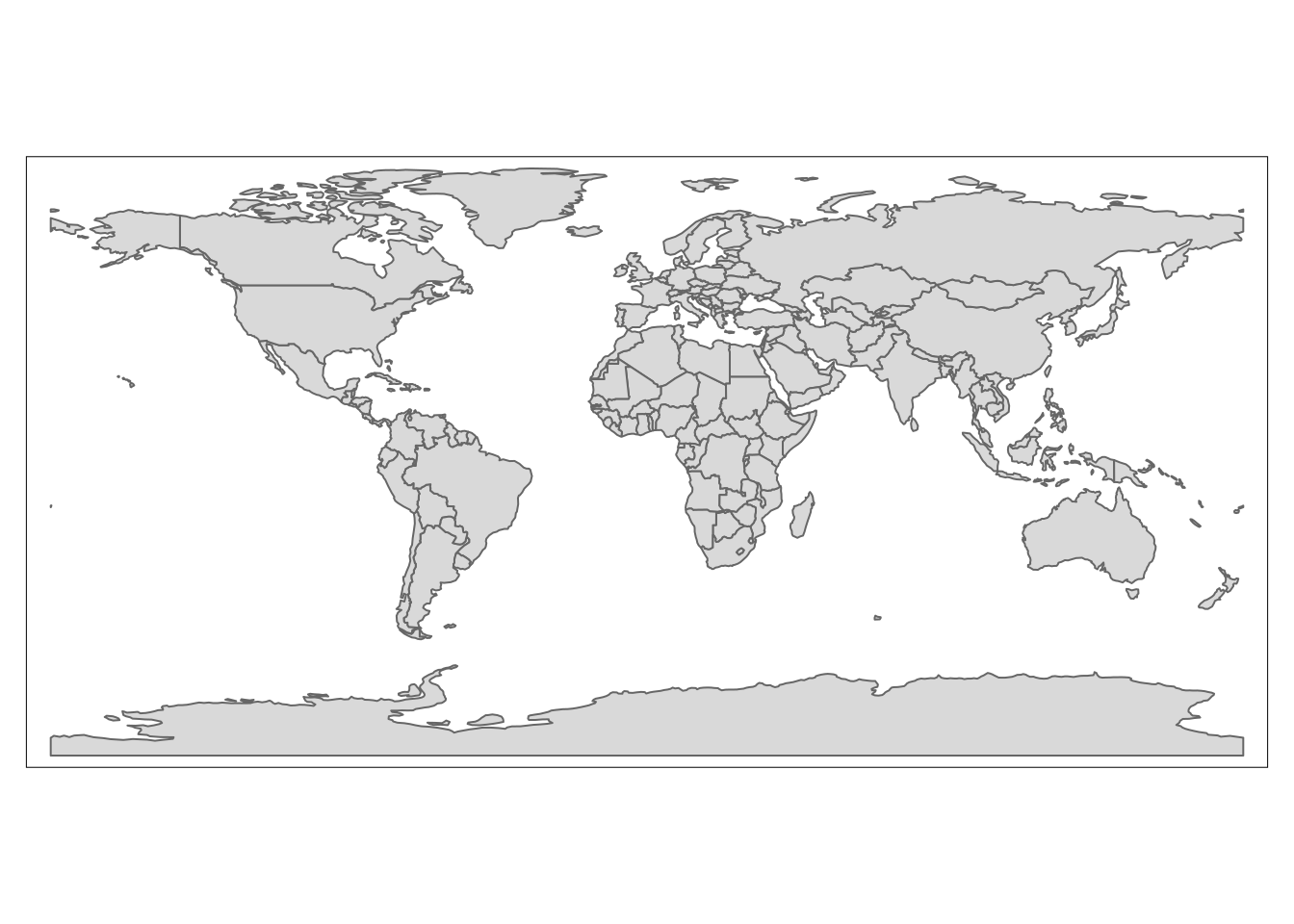
Viola! we’ve made our first map! Now lets start making it meaningful.
3 Customize
tmap is similar to ggplot in that
- everything is a layer and
- it works really well with tidyverse packages
Therefore, we can use dplyr to include the countries/regions which we want to display on map.
For instance, we don’t have IELTS data for Antarctica so lets remove it from the map.
library(tidyverse)

scores_and_geoms %>%
  filter(continent != "Antarctica") %>%
  tm_shape() +
    tm_polygons()
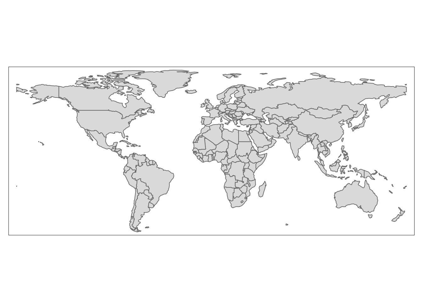
Going through the code above, we are telling R to:
- take
scores_and_geoms - keep all rows as long as the observation in
scores_and_geoms$continentdoes not equalAntarctica - create the shape (aka, the blank map)
- add country lines
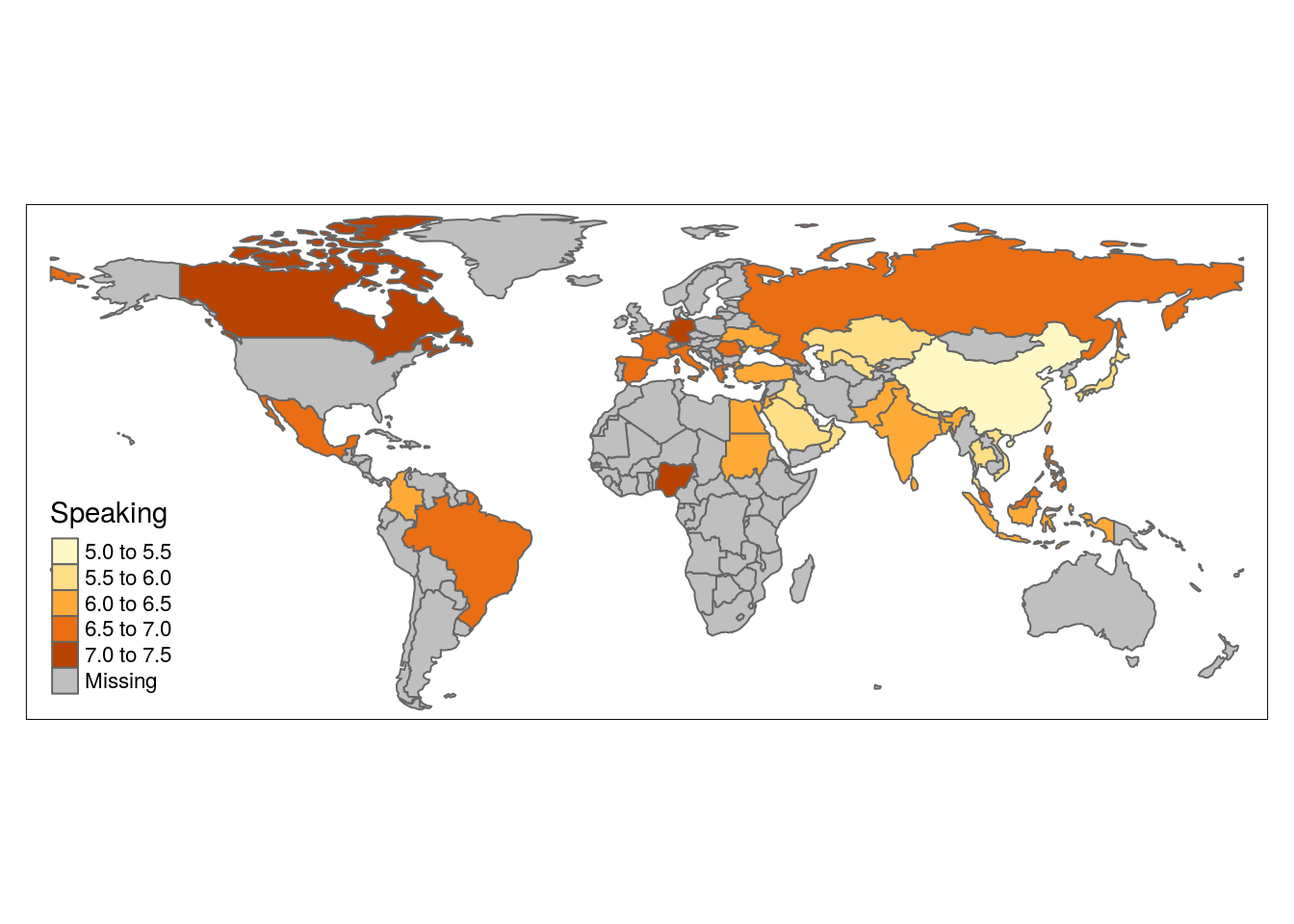
Now lets add some IELTS data. I’m interested to see speaking scores so lets have the color of the country reflect the average speaking score. To do so, pass the variable of interest, in our case scores_and_geoms$Speaking, to the color argument in the tm_polygons() layer.
scores_and_geoms %>%
  filter(continent != "Antarctica") %>%
  tm_shape() +
    tm_polygons(col = "Speaking")
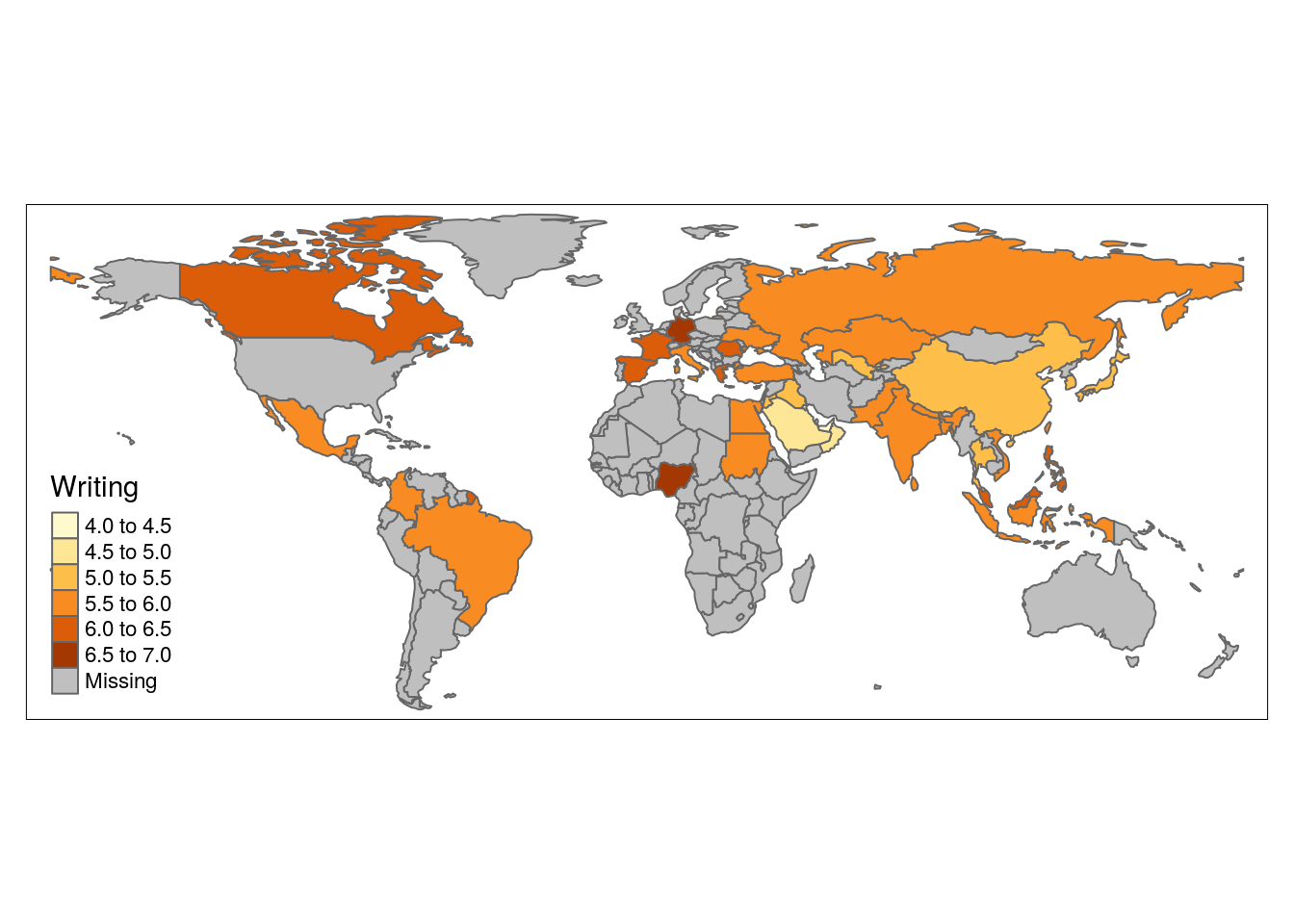
What if you wanted to look at writing? Just change color to “Writing”
scores_and_geoms %>%
  filter(continent != "Antarctica") %>%
  tm_shape() +
    tm_polygons(col = "Writing")
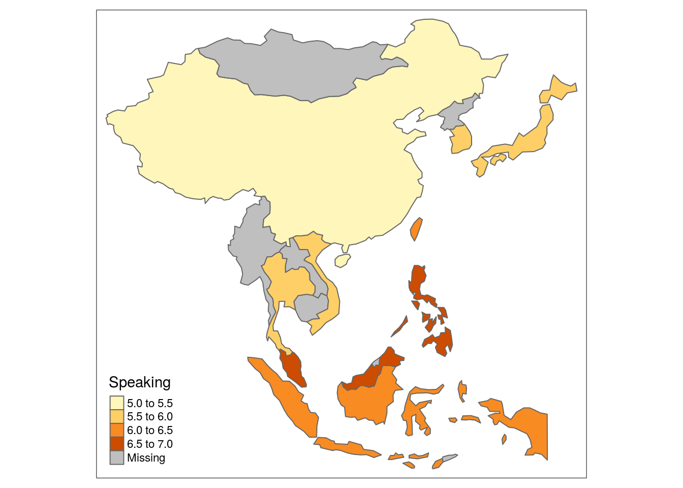
Since I’m based in China, I’m curious to see how East Asian countries compare so lets use dplyr to only plot countries from East and South East Asia.
scores_and_geoms %>%
  filter(subregion %in% c("South-Eastern Asia", "Eastern Asia")) %>%
  tm_shape() +
    tm_polygons(col = "Speaking")
As for the title, add a tm_layout() layer and pass it as an argument.
scores_and_geoms %>%
  filter(subregion %in% c("South-Eastern Asia", "Eastern Asia")) %>%
  tm_shape() +
    tm_polygons(col = "Speaking") +
    tm_layout(title =  "Average IELTS Speaking Score",
              inner.margins = c(0.1, 0.02, 0.1, 0.02))
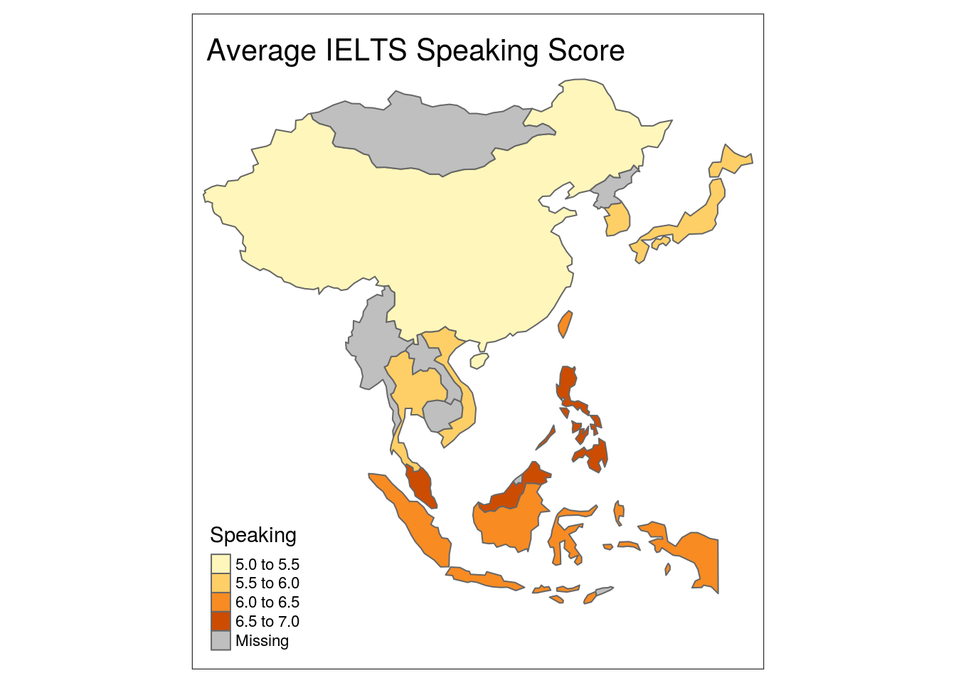
“What is inner.margins?”
Those are coordinates for how to position the title in the plot and you can read all about them here. Play around with them until you get them where you want them.
Conclusion
This post is already longer than I planned so we’ll explore some more features in the next post. Until then, happy coding!
Full Code
library(sf)
library(tmap)
library(tidyverse)

url <- "https://github.com/educatorsRlearners/datasets/blob/master/scores_and_geoms.RDS?raw=true"
temp <- tempfile()
download.file(url, temp)

scores_and_geoms <- readRDS(temp)

#remove the unnecessary variables
rm(temp, url)

#convert to shape file object
scores_and_geoms <- st_as_sf(scores_and_geoms)

#world map
tm_shape(scores_and_geoms) + #shape
  tm_polygons() #borders

#world map omiting Antarctica
scores_and_geoms %>%
  filter(continent != "Antarctica") %>%
  tm_shape() +
    tm_polygons()

#Same as above but with country color reflecting average IELTS Speaking Score
scores_and_geoms %>%
  filter(continent != "Antarctica") %>%
  tm_shape() +
    tm_polygons(col = "Speaking")

#Same as above but reflecting average IELTS Writing Score
scores_and_geoms %>%
  filter(continent != "Antarctica") %>%
  tm_shape() +
    tm_polygons(col = "Writing")

#East Asia with country color reflecting average IELTS Speaking Score
scores_and_geoms %>%
  filter(subregion %in% c("South-Eastern Asia", "Eastern Asia")) %>%
  tm_shape() +
    tm_polygons(col = "Speaking")

#Same as above but with a title
scores_and_geoms %>%
  filter(subregion %in% c("South-Eastern Asia", "Eastern Asia")) %>%
  tm_shape() +
    tm_polygons(col = "Speaking") +
    tm_layout(title =  "Average IELTS Speaking Score",
              inner.margins = c(0.1, 0.02, 0.1, 0.02))
